01 / Shared calendar
The dentist moved it. Again.
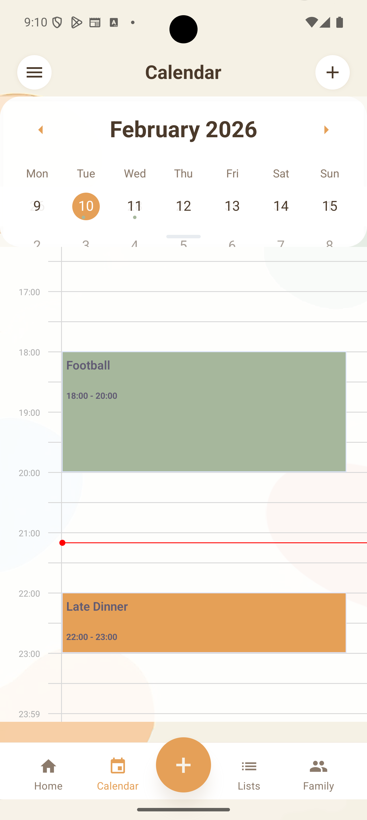
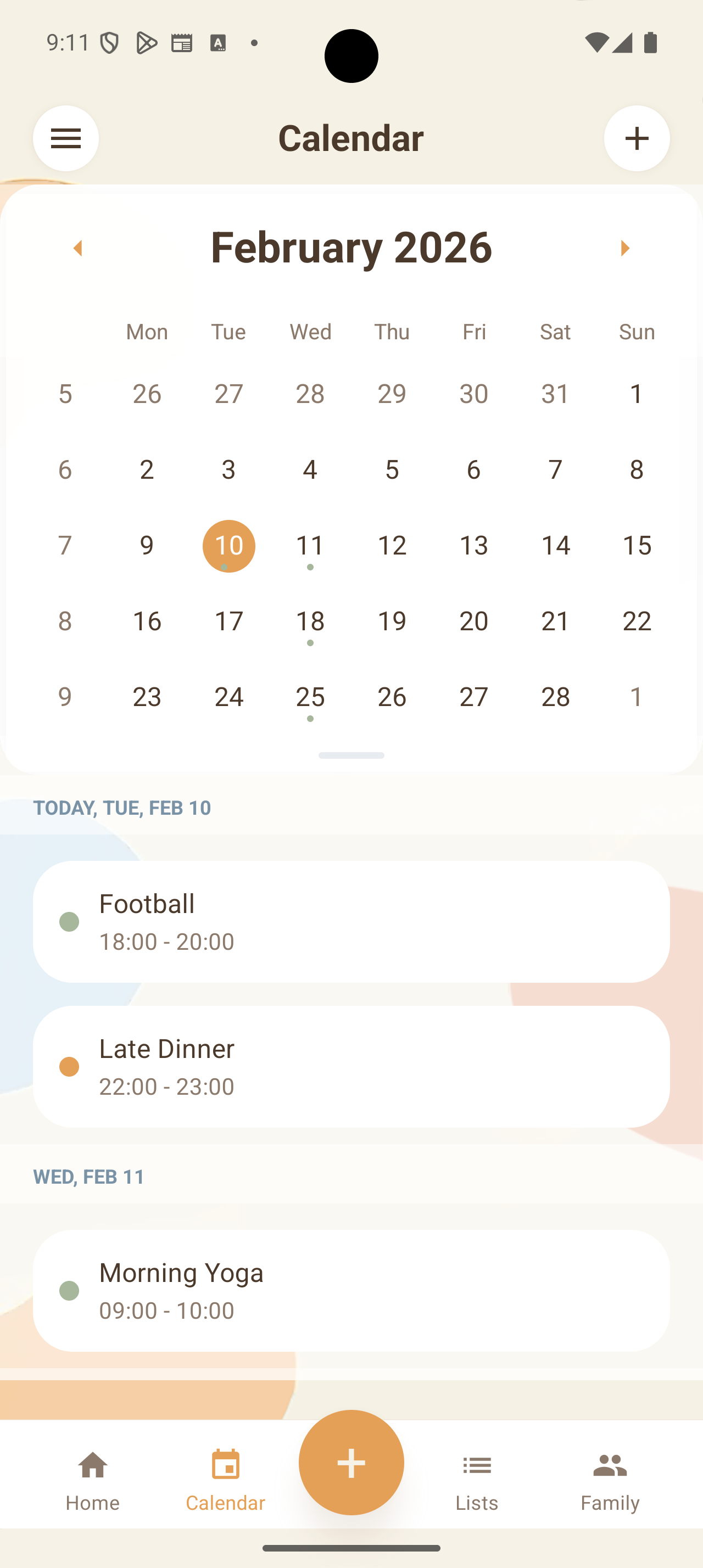
Update the family calendar once. The new time is there for everyone who needs it, alongside the rest of the week.
Made for plans you share
Share events, shopping lists, and to-dos with your household. Add or update a detail once, and everyone has the same place to check.
Each family member uses their own account in the same shared family space.
What it does
Plans change. Things get added. Other things get done. Planily gives your household a shared place to keep up.
Update the family calendar once. The new time is there for everyone who needs it, alongside the rest of the week.
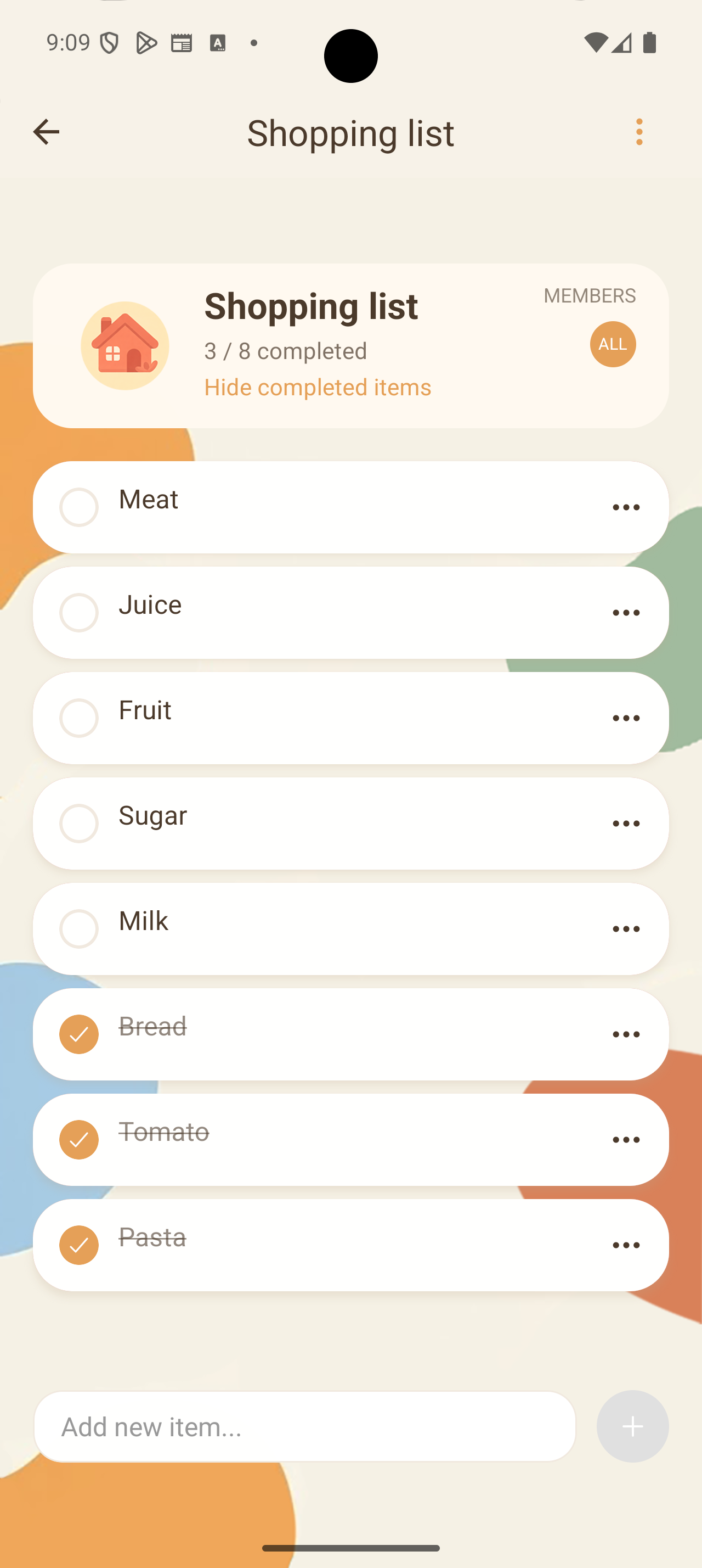
Put milk on the shared list when it comes to mind. Whoever gets to the shop can see it and check it off.
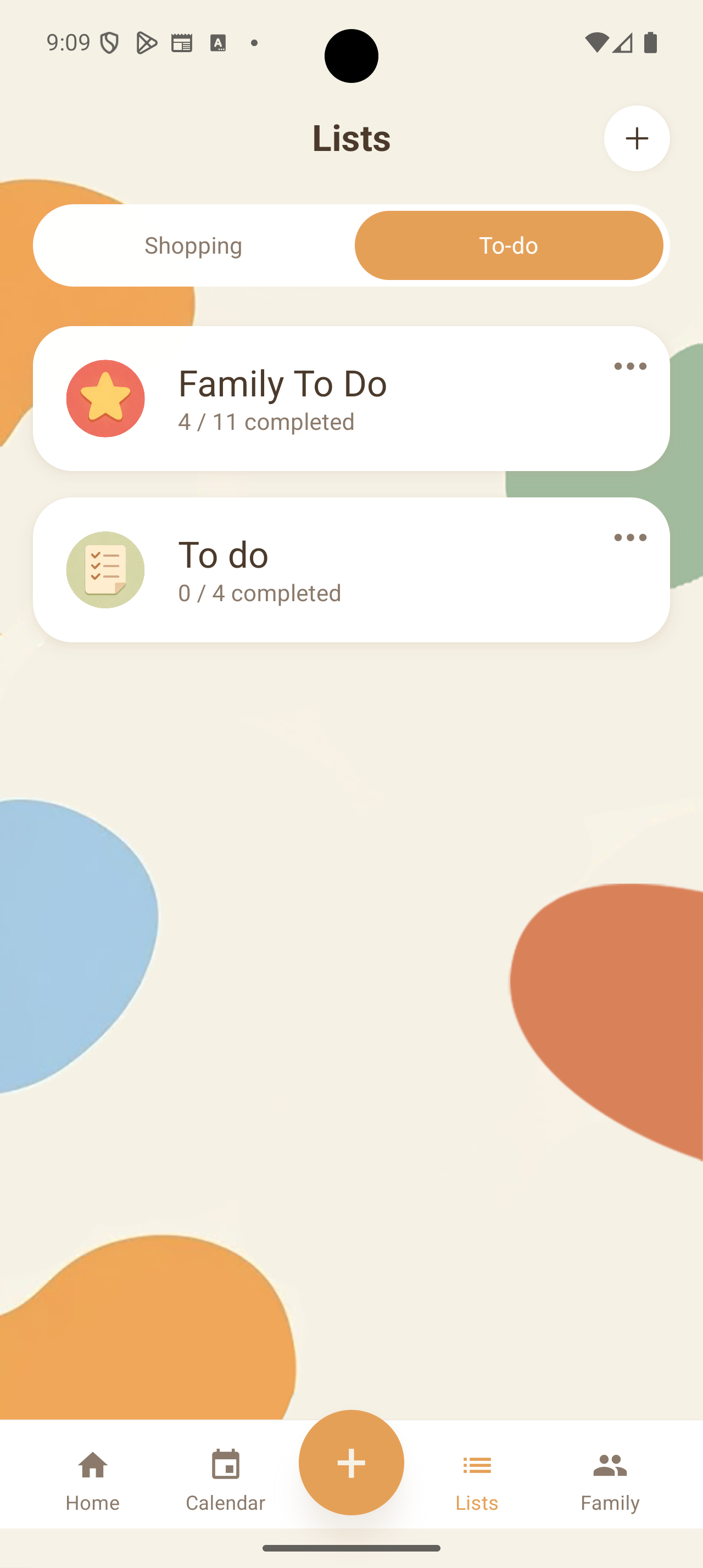
Keep the household's tasks together and mark them complete as the week moves along. Everyone can see what's still left.
Start together
Set up your family space, then bring in the people who share the week with you.
Install the app on Android or iPhone and create your account.
Create a family group and share its invitation link or code.
A calendar event or shopping item gives everyone something useful to see and update.
Good to know
Here are the things worth knowing before you invite everyone in.
Read our privacy policyYes. Family members can use Planily on their own iPhone or Android phone and join the same family group.
Create a family group in the app, then share its invitation link or code. The person you invite creates their own account and joins your group.
Yes. Planily supports calendar import and export. The app guides you through the setup for your calendar.
Content you add to a family group is visible to its members. You can read more about family content in our privacy policy.
Yes. Planily currently offers no payments or subscriptions.
Make the week easier to share
Get Planily, then invite the person you'd usually text about it.